
The Unspoken Language of Design: Why Luxury Spaces Speak Through Materials
Artisan Paint · Imported Artisan Paint Brands · Top 10 Artisan Paint Brands · Luxury Artisan Paint · High Value Artisan Paint
What is the design “subtext” perceived by iLuvVivid?
Introduction
Why do some spaces, despite utilizing equally expensive colors, evoke a sense of awe, while others feel ‘flat’ and ‘superficial’? The difference may lie in the dimensionality of the design language. When color serves as the foundation, ‘material’ often becomes the subtext that determines a space’s depth and emotional resonance.
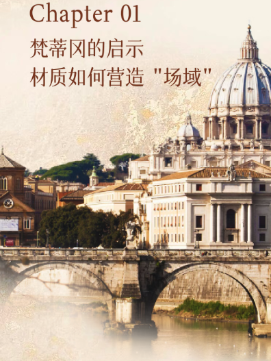
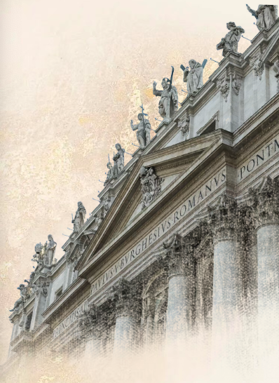
To explore this ‘subtext,’ our color engineers delved into three of Rome’s great artistic sanctuaries: the Vatican Museums, Palazzo Colonna, and Galleria Borghese. From the order of the Renaissance, to the virtuosity of the Baroque, and the refinement of Neoclassicism, the spirit of each era is concentrated within the ‘materials’ of these halls. This article shares our findings, hoping to provide new inspiration for aesthetics enthusiasts who pursue exceptional spatial experiences.
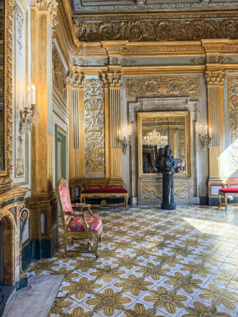
Part 1: The Revelation of the Vatican – How Materials Create an “Atmosphere”
The so-called ‘atmosphere’ is an all-encompassing sensory experience evoked by a space that transcends the visual, capable of instantly calming or uplifting one’s emotions. At the Vatican, it was precisely this ‘atmosphere’ that we contemplated.

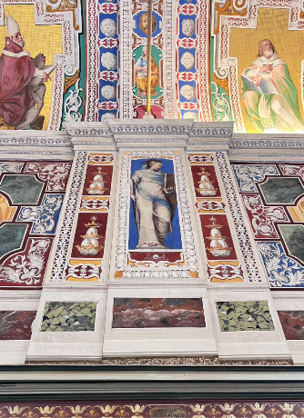
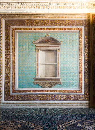
In the walls of the Raphael Rooms, the ‘fresco’ technique allows color to merge seamlessly with the architecture, while light creates a unique diffuse reflection on the matte mineral surface. This produces a tranquil, sacred ‘atmosphere’ that instantly quiets those within it. The sensation evoked by these ‘breathing walls’ stems from the material itself.
Hidden Treasure
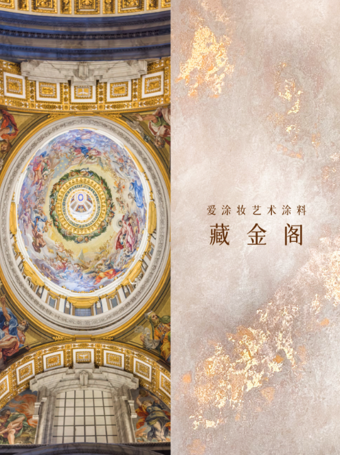

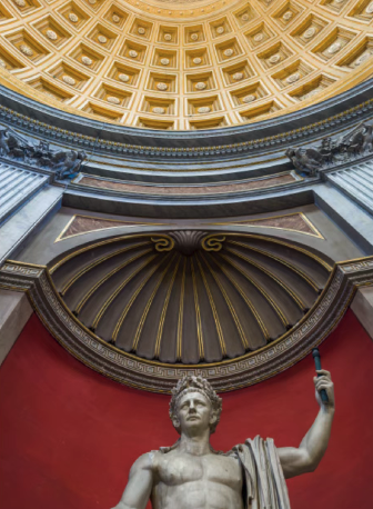
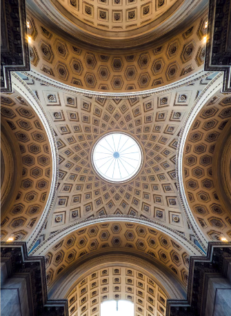
同样,在梵蒂冈的穹顶与地面,大量运用的藻井(Coffers)抬头仰望,藻井层层递进,内部常常饰以金箔或雕刻出精致的花卉图案,象征着天堂的神圣秩序。
Gold Leaf


要在当代空间中复现这种高级的、能调节情绪的‘场域’,关键在于选择能与光线进行微妙互动的材质。例如,灵感源于湿壁画的艺术涂料,能赋予墙面柔和的漫反射效果;而带有金箔的艺术涂料,则能为现代的线条注入古典的韵味与精致感。
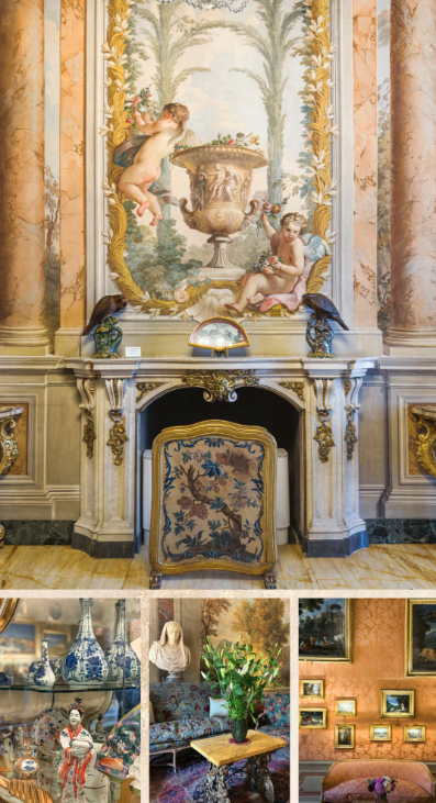
Part 2: The Revelation of the Galleria Colonna — How Materials Create “Layering”

“Layering” refers to the richness and harmonious interplay of different elements within a space, both visually and tactilely. It rejects monotony, instead constructing a confident yet understated luxury through the careful orchestration of materials, finishes, and colors, making the space deeply engaging.
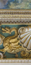
The Colonna Gallery is itself a symphony of materials. It doesn’t simply display artworks; rather, it facilitates a ‘dialogue’ among the depth of oil paintings, the warmth of marble, the gleam of gold leaf, and the softness of silk wall coverings, collectively building a rich and harmonious visual hierarchy.
It is worth mentioning that patterns are also a significant source of layering. For instance, the recurring floral motifs on tapestries and the natural designs in wall fabrics introduce a sense of rhythm, lending the space both order and cadence.
Not only do they enhance visual longevity, but they also often carry cultural and emotional memories.


Entering the Princess Isabella Suite, the expression of “layering” becomes more intimate and feminine. Here, soft pink silk wall coverings, Rococo-style curved mirrors, and crystal chandeliers complement each other, creating a warm and refined sense of living.
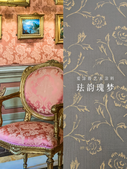

Furthermore, Chinoiserie patterns, inspired by Eastern aesthetics, were also discovered, showcasing the eclectic fusion of aristocratic tastes during that period.
In modern design, this sophisticated sense of “layering” can be achieved through the nuanced pairing of different paint sheens and textures.
For example, using an artisanal paint inspired by the patterns of various wallpapers within the space as a base, and then accentuating details with a satin-finish paint reminiscent of silk, can subtly elevate the refinement of the interior.
Part 3: The Revelation of the Borghese Gallery — Activating Materials, Evoking Sensation
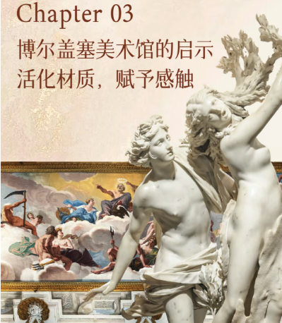
If the Vatican represents order, and the Colonna Gallery represents layering, then the Borghese Gallery represents “miracle.” Stepping inside, our focus shifts from narrative to “sensation”—how art imbues cold materials with warmth and a pulse.
“Activation” refers to the use of masterful craftsmanship to make a material transcend its physical properties, evoking a lifelike quality and tactile sensation that feels almost contrary to its nature. In spatial design, “activating” a material means transforming foundational elements like walls from passive backdrops into vibrant “characters” capable of emotional dialogue with people.
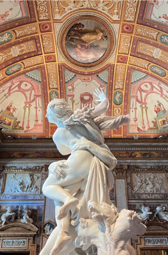
The soul of the Borghese lies in Bernini. In The Rape of Proserpina, the detail where Pluto’s fingers sink into the maiden’s thigh—here, the hard stone conveys a soft, supple, and elastic sensation.
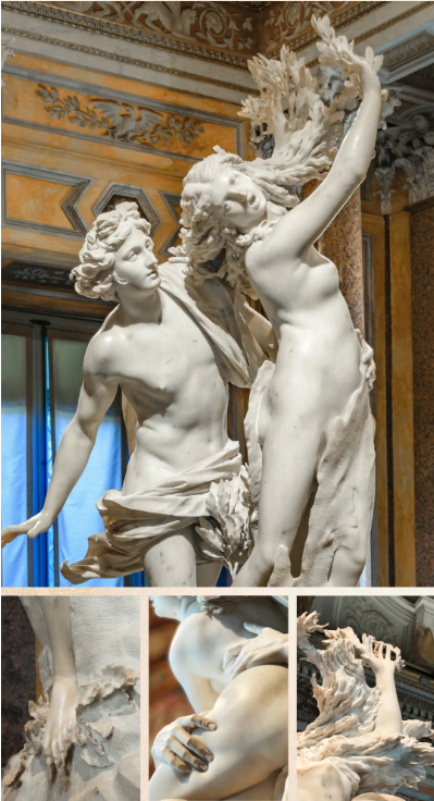
In Apollo and Daphne, Daphne’s body is “transforming” into a laurel tree, with delicate leaves sprouting from her fingertips. This is the ultimate expression of material evoking sensation—it no longer merely tells a story but allows the viewer to tangibly “feel” the very moment the story unfolds.
In wall design, we can similarly draw inspiration from this concept. For instance, using a stone-effect paint with a mirror-like finish can delicately capture light and shadow, much like the polished marble in Bernini’s sculptures.

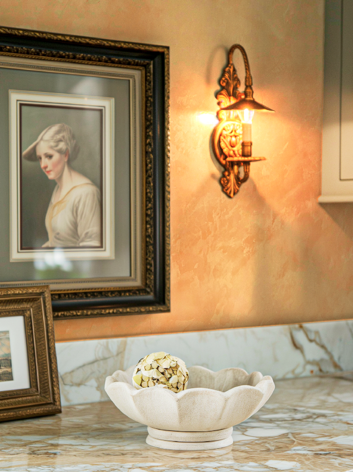
As light shifts and plays across it, the wall is no longer static but becomes a dynamic, living interface, thereby ‘activating’ the entire space.
Design Takeaways
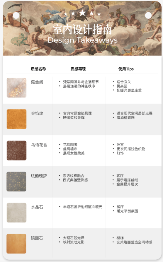
| Texture Name | Texture Reproduction | Usage Tips |
|---|---|---|
| Hidden Treasure | • Vatican coffer and gold leaf details • Layered sacred order | • Suitable for entryways • High-ceiling areas • Complements warm lighting for a more solemn feel |
| Gold Leaf | • Classical dome gold leaf texture • Reflects soft golden glow | • Ideal for local accents in modern spaces • Adds a sense of refinement |
| Spring | • Bird and flower patterns • Silk wallcoverings • Showcases feminine elegance | • Bedrooms • Dressing rooms paired with light-colored fabrics and lighting |
| Rose Reverie | • Fusion of Eastern patterns • Western-style elegant wall decoration | • Living rooms • Display areas paired with velvet and metal to enhance layering |
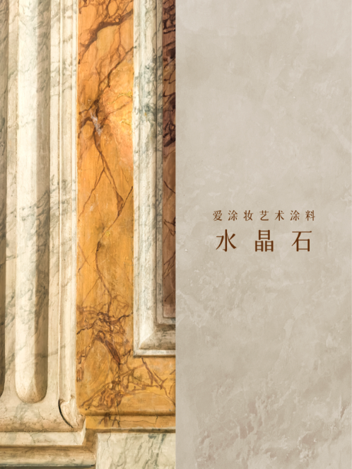
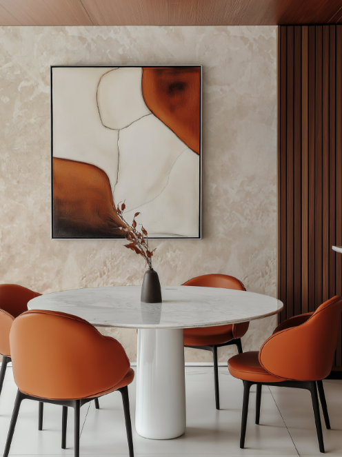
| Venetian Marble | • Semi-transparent stone crystals refract delicate warm and cool light | • Dining areas • Warm lighting balances the atmosphere |
| Mirror Marble | • Marble-like luster • Reflects flowing light and shadow | • Staircases • Entryway walls to create spatial dynamism |
Color defines the character of a space, while material bestows its soul. From crafting an “atmosphere,” to building “layering,” and finally to “activating” sensation, mastering the language of materials is the essential path to creating exceptional interiors.
Explore the “Textures of Rome” and begin your next narrative journey for the home.
Why Choose iLuvVivid Artisan Paint?
We know you’re not just looking for paint—you want a partner to help elevate your space. iLuvVivid’s artistic coatings deliver stunning color with premium performance, making it easy to achieve your vision in one step.
Website: www.iLuvVivid.com
About Us